Guide
How to Choose a Minecraft Block Palette
Great Minecraft builds almost always start with a good block palette. Here is a simple, repeatable way to choose one — even if you are not a "designer".
What is a block palette?
A block palette is just the small set of blocks you decide to build with before you place anything. Most strong builds use somewhere between four and eight blocks total — not because more is forbidden, but because a tight palette reads as intentional while a random pile of textures reads as noise.
Think of it like the colors a painter squeezes onto a palette: you can mix and combine them freely, but you chose them on purpose and they work together.
The primary / secondary / accent rule
The easiest framework is to sort your blocks into three jobs. The primary is your main wall material and should cover roughly 60% of the build — something calm and not too busy, like  smooth stone,
  white concrete, or
  stone bricks. The secondary (about 30%) supports it: structural wood, a contrasting
  stone, or trim that frames windows and corners.
The last 10% is your accent — the blocks that add personality and catch the eye. Copper, gold, lanterns, glazed  terracotta, or a pop of color all work here. The key is restraint: accents only feel special because there are few of them.
A simple, reliable starting set looks like this — a calm primary, a warm secondary, and one or two accents:


If you are stuck, start from a finished palette and reverse-engineer it. Browse community palettes and look at how the block counts split across those three roles.
Mind texture and detail level
Minecraft blocks vary wildly in "busyness". Stone bricks,  deepslate tiles, and bookshelves are visually noisy; concrete, planks, and wool are flat and quiet. A common beginner mistake is combining several busy blocks at once, which makes a wall look cluttered from a distance.
A reliable trick: pair one busy block with one or two quiet ones. Let the quiet blocks be the large surfaces and the busy block be the detailing. Palettes featuring deepslate are a good example —  deepslate is busy, so it shines as trim against calmer materials.
Match the palette to the theme
Your palette should answer the question "where and when is this?" before you decide individual blocks. A weathered fortress and a  glass skyscraper need completely different materials even though both are "buildings".
Rather than reinventing this each time, start from a style: medieval palettes lean on cobble and timber, modern palettes on concrete and glass, and cottagecore palettes on pastel terracotta and flowers. Browse by theme to find the vibe, then tweak.
Test it before you commit
Before you build the whole castle, place a small test patch — one wall section with your primary, secondary, and accent together. Step back to normal render distance and check that it reads clearly. If two blocks "fight" or blur together, swap one.
You can skip the guesswork entirely with the palette builder: drop in blocks, lock the ones you like, and randomize the rest until the combination clicks. When it does, publish it so other builders can find it.
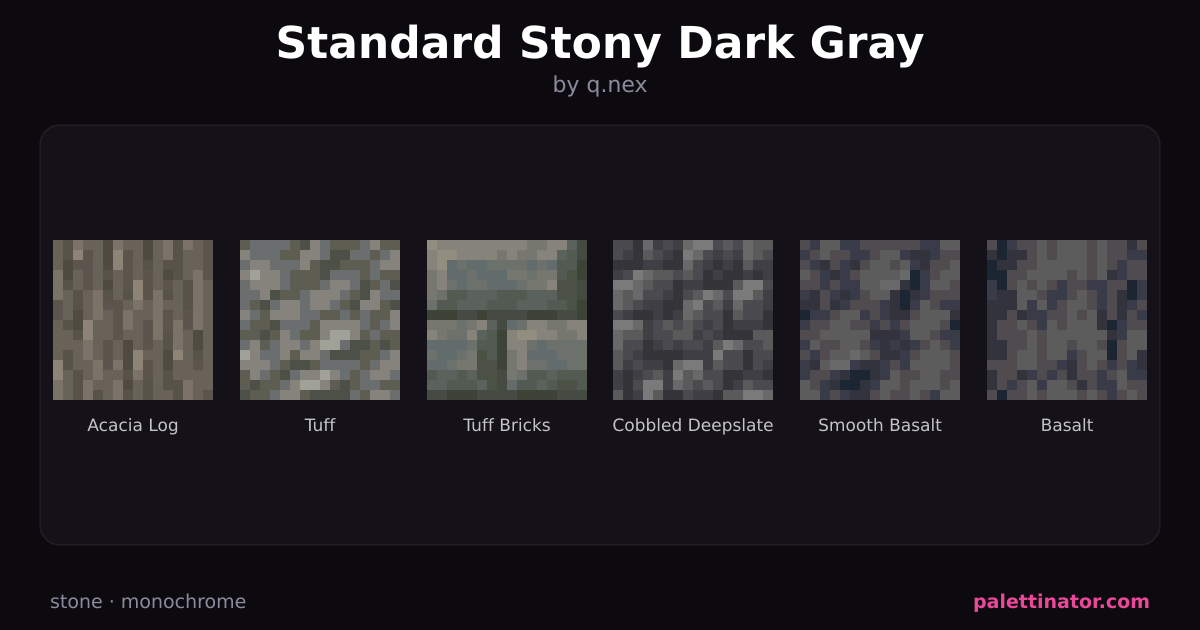
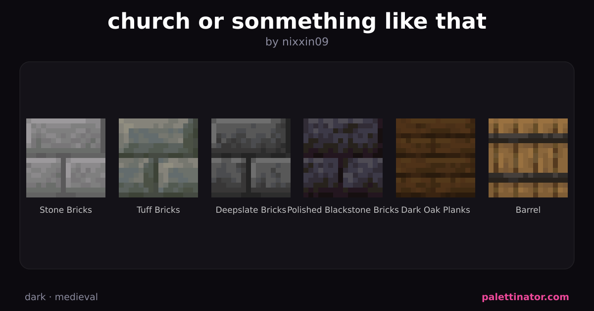
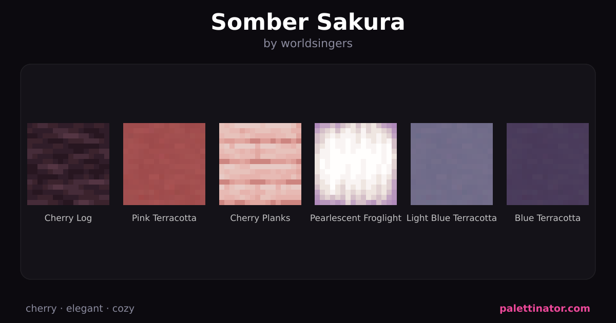
Need inspiration? Here are some of the community's most popular palettes: