Guide
The Minecraft Color Blocks Guide
Color is the fastest way to make a build pop — and the fastest way to ruin one. Here is how the three main colored block families differ and how to use them well.
Concrete vs terracotta vs wool
Minecraft gives you three big families of colored building blocks, and they are not interchangeable. Concrete is bright, flat, and saturated — it reads as modern, clean, and bold.  Terracotta is muted and earthy, with a subtle texture that makes it the most "natural" of the three and the backbone of desert and southwestern builds. Wool is soft and slightly fuzzy, great for interiors, banners, and cozy detailing but a little flat for big exteriors.


Glazed terracotta is its own thing: a patterned, almost tile-like block best used sparingly for floors, borders, and feature panels.
The 60-30-10 idea applies to color too
A build does not need many colors — it needs the right ratio. Pick one dominant tone, one supporting tone, and one accent, the same way you would with materials (see how to choose a palette). Three well-chosen colors almost always beat seven.
When in doubt, let a neutral (white, grey, black, or an earthy terracotta) dominate and use the saturated color only as the 10% accent. This is why so many striking builds are "mostly grey concrete with one bold color".
Warm vs cool, and why it matters
Colors that sit near each other on the color wheel (warm: red, orange, yellow / cool: blue, green, cyan) feel harmonious together. Mixing a warm dominant with a cool accent — or vice versa — creates contrast that draws the eye exactly where you want it.
For earthy, sun-baked palettes, the terracotta family is unbeatable: see desert palettes. For soft, pastel color, look at cottagecore palettes, which lean on pink and  yellow terracotta with flowers.
Break up flat color surfaces
Large single-color walls look cheap. Even if a wall is "all  blue concrete", break it up with depth: trapdoors, stairs, a frame of a darker shade, or a window line. Texture variation reads as craftsmanship; flat panels read as unfinished.
Mixing two adjacent shades of the same color (e.g. light blue + cyan) is a subtle way to add life without introducing a new color.
Find color combinations that work
The fastest way to learn color is to study combinations other builders already nailed. Browse the community palettes, filter by the style you want, and notice how rarely the best ones use more than three colors. Then open the builder and try your own.
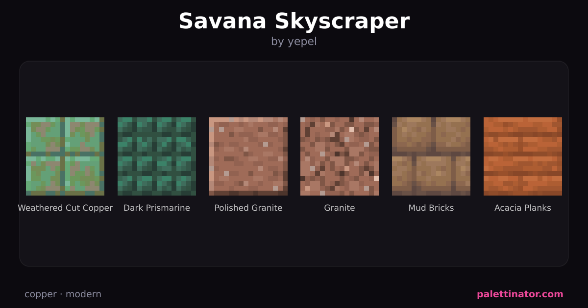
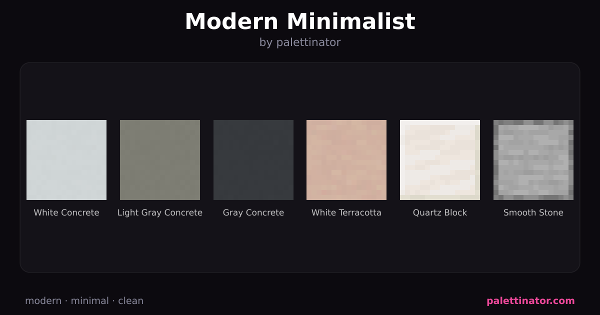
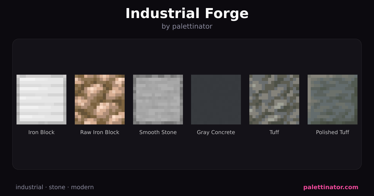
Modern, color-forward palettes from the community: